A clearer, smarter workflow system that improves agent efficiency, reduces operational friction, and scales with organisational needs.
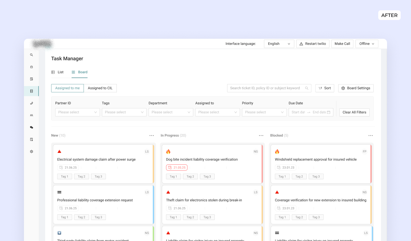
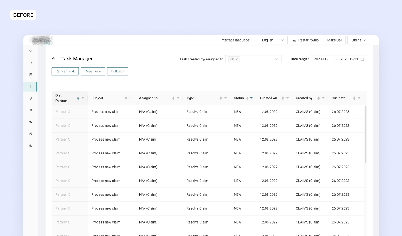
Drag the slider to see a before and after.
Service Designer, Product Designer Lead
PO, BE and FE engineers, Customer Agents, UX content
Nov 2024- Feb 2025
CIL platform serves as the operational backbone for iptiQ’s customer service teams, bringing together policies, communication, requests, and tasks in a single environment. As the organisation grew, so did the number of tools, partners, policies, and communication channels involved in completing everyday work.
I initiated a service design study to bring clarity to how agents, partners, and systems interacted. This research mapped the ecosystem of actors, workflows, and bottlenecks, and revealed that task management was one of the most pressing problems affecting efficiency and user adoption. Adoption of the task manager feature was low: agents struggled with long lists, poor prioritisation, and fragmented workflows, often resorting to Outlook reminders or Excel sheets to stay on top of their work.
Improving the clarity, consistency, and scalability of this operational ecosystem became essential for both agent effectiveness and platform evolution.
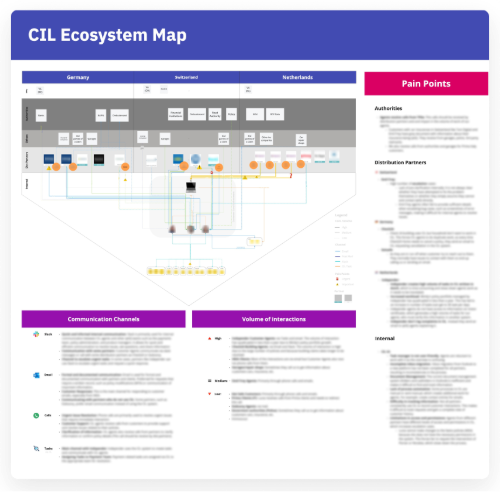
To understand how work truly flowed across the organisation, I initiated a broad discovery phase mapping the ecosystem of actors, tools, communication channels, and interaction volumes. Through interviews with agents, I visualised how they interacted with teams, partners, and systems across CIL.
The ecosystem map revealed hidden friction points and manual workarounds, with the task manager emerging as one of the most significant bottlenecks—confusing for agents, misaligned with real workflows, and a frequent source of delays with partner teams.
When I shared these findings with the Product Owner and Backend team, we aligned on prioritising the Task Manager as the highest-impact area, setting the direction for the next phase of research and design.
I then conducted focused interviews with customer agents and payment specialists, combined with a shadowing session and insights from previous usability tests, to understand their specific workflows and pain points.
Main discoveries were:
Task visualization & organization:
Hard to distinguish new vs. old tasks; no clear overview of urgent items. Agents relied on external tools like Excel.
Task tracking & comments:
History and comments hiddin inside each task slowed workflows and risked missing context.
Managing pending tasks:
No way to manage follow-ups in the system. Agents used Outlook/Ecel/post-its, risking lost tasks.
Tasks status:
Manual updates often forgotten. "New" tasks already in progress, causing confusion and duplication.
Leadership wanted better visibility into workloads and operational bottlenecks—framing this redesign as the foundation for long-term operational change, not just a UI improvement. I synthesized research into How Might We statements to guide exploration:
#1 - HMW help agents understand which tasks to focus on first, so they can work more efficiently and avoid missing urgent issues?
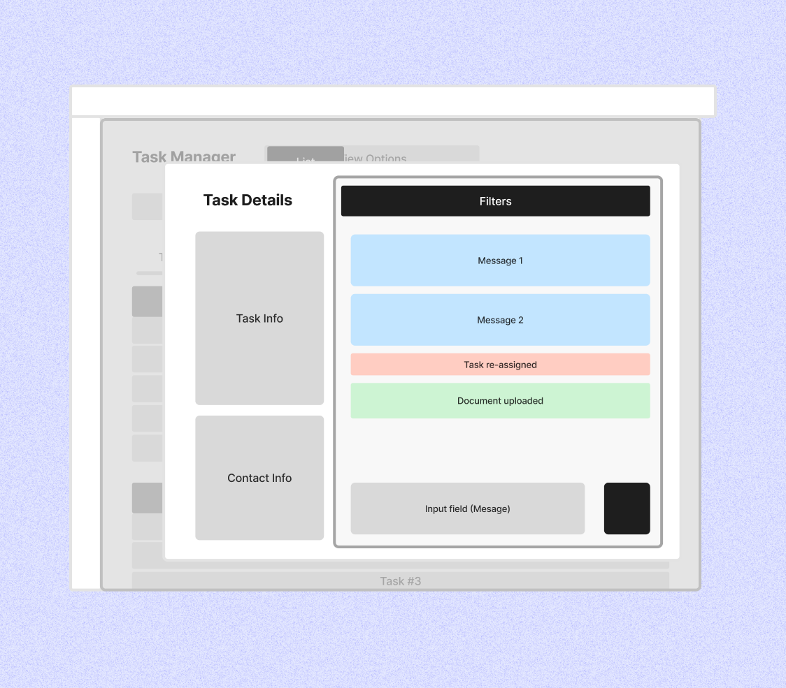
#2 - HMW make it easier for agents to see all relevant interactions for a task in one place, so they can quickly understand what has happened and what still needs attention?
#3 - HMW support agents in managing tasks that require follow-up, so they don’t have to depend on external tools and risk missing important work?
To ensure feasibility and build shared ownership, I facilitated a co-creation workshop pairing engineers, content writers and POc with agents. This single session replaced multiple feedback loops and aligned the team on three strategic goals:
1. Unify requests into one overview
2. Enable accurate workload tracking
3. Reduce manual work
I translated the HMWs into design explorations, starting with low-fidelity wireframes to test different directions quickly.
Some approaches explored for HMW1:
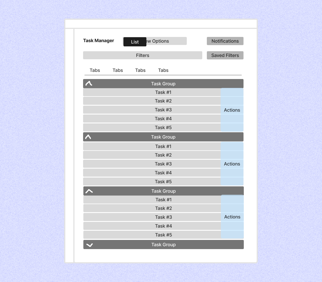
List view:
A familiar and compact layout that scaled well for large volumes of tasks. Grouping and filters helped structure work, but prioritisation and progress were hard to scan, especially within long lists. Urgency and context often remained hidden.
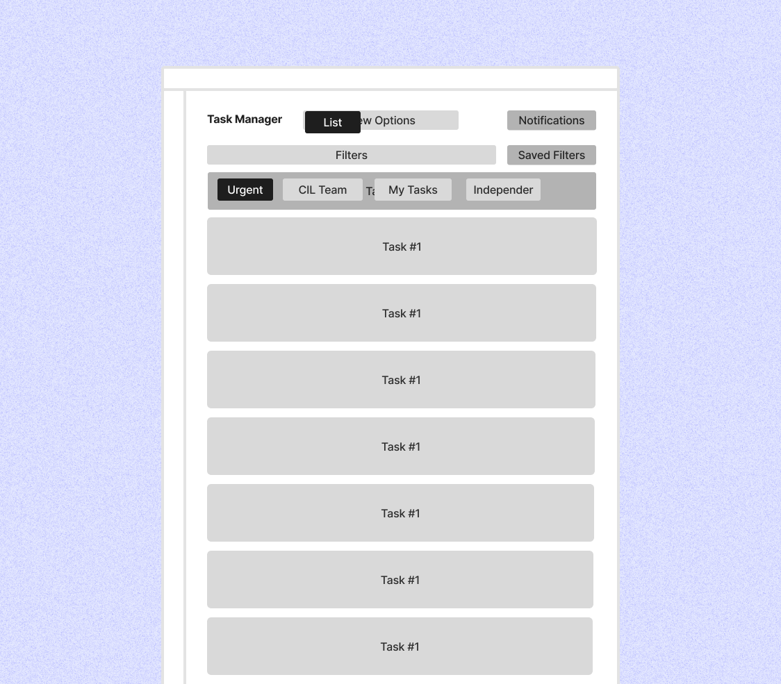
Enhanced list:
An iteration on the classic list with quick filters for faster access to relevant tasks. Easier to scan and lower effort than the basic list, but still dependent on filters rather than visual cues. Progress and prioritisation remained implicit.
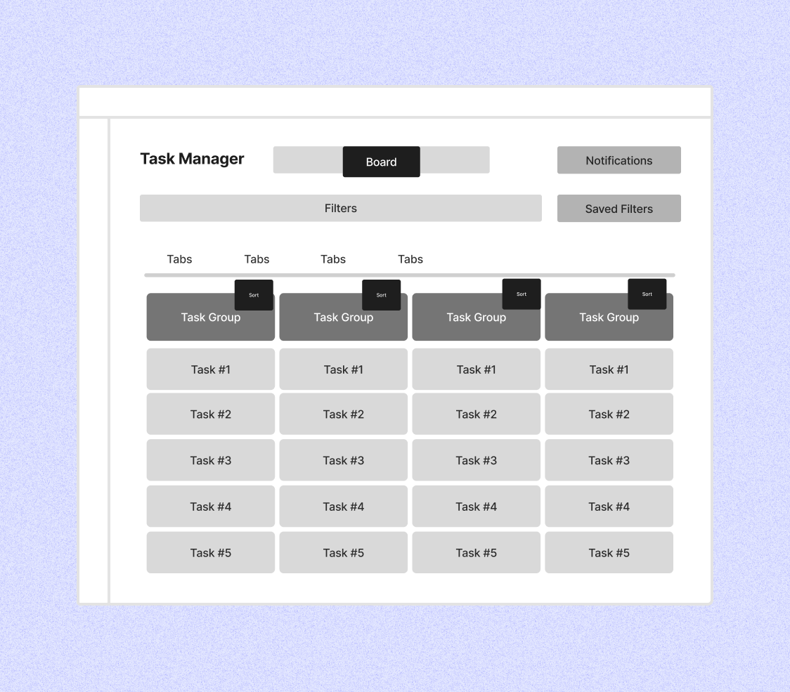
Kanban board:
A visual approach using columns to represent task status and progression. It made ownership, bottlenecks, and priorities immediately visible and matched agents’ mental model of work. While less compact and requiring onboarding, it best addressed visibility and flow.
Some approaches explored for HMW-2:
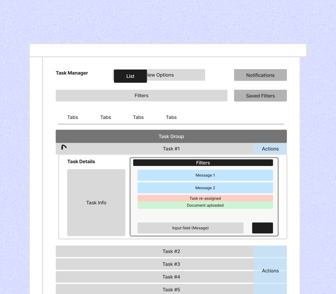
Expandable details:
Inline expansion showed recent interactions directly in the list, allowing quick checks without losing overview. It worked well for simple cases but became cluttered and hard to scale with long histories or multiple expanded tasks.
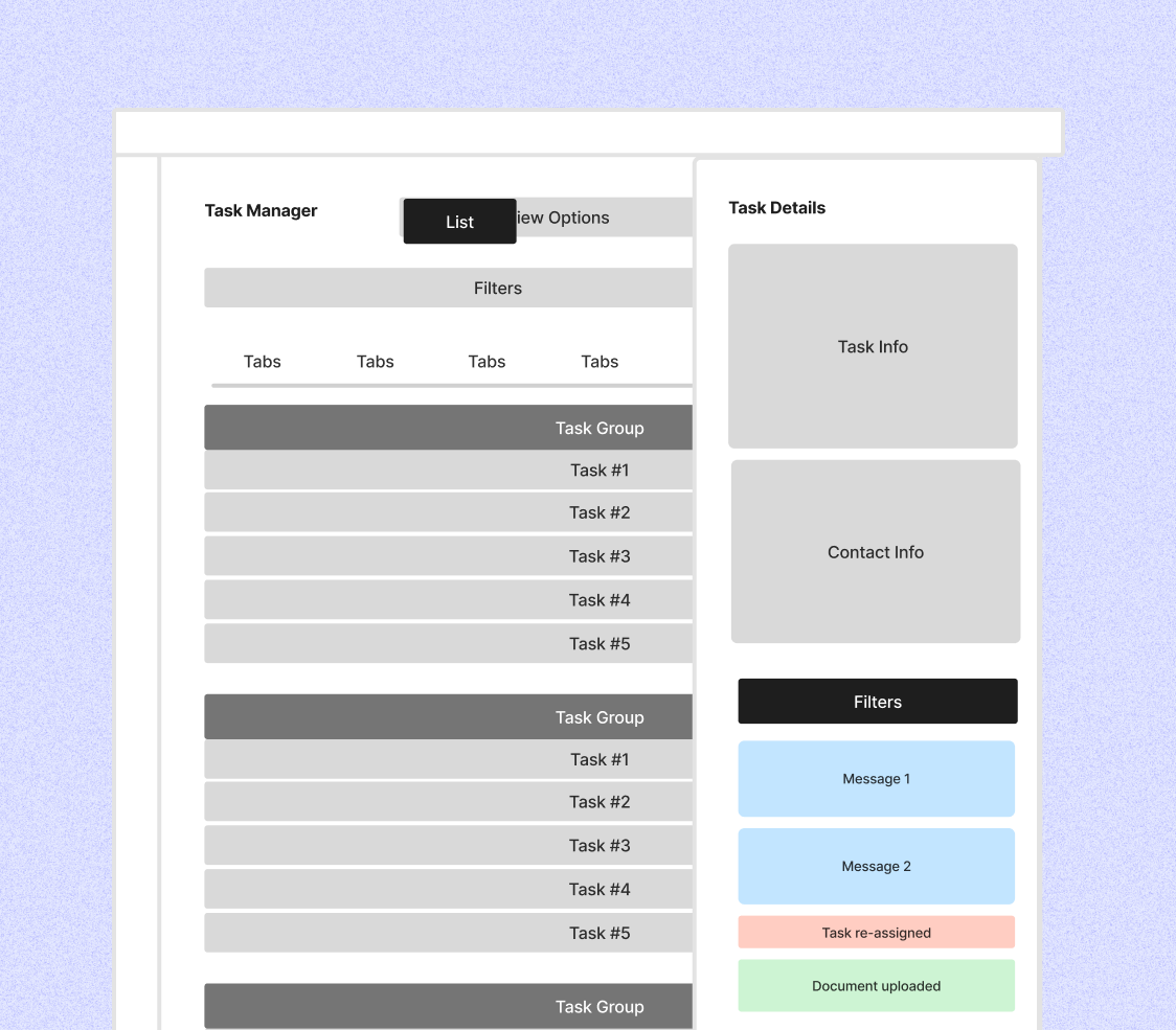
Lateral drawer:
A side panel kept the full interaction history visible next to the task list, making it easier to understand past actions, current status, and next steps at a glance. This pattern scaled best for complex and ongoing tasks.
Modal:
Modals helped agents focus on a single task and review short interaction histories. However, they hid the task list, slowed down task switching, and made it harder to assess what still required attention across multiple tasks.
We moved forward with the Kanban approach because it provided clearer visual grouping by status while enabling the backend team to implement structural changes that would make the system more scalable.
Key design decisions:
Prototypes built in Figma Make were used to test with internal agents to validate the approach.
What worked:
What needed iteration:
These friction points were refined before rollout.
After usability testing validated the direction, I partnered with frontend and backend engineers to implement the solution. Together we addressed edge cases from testing—automating status changes, clarifying date fields, and refining reassignment logic.
Phased rollout approach:
We released an MVP in pre-production with a small group of agents, allowing them to trial the system with minimal risk. Feedback from this phase informed critical refinements before expanding rollout.
The full launch followed a progressive release strategy: we started with simpler use cases (agents with fewer tasks, single-market operations) and gradually expanded to more complex scenarios. This gave engineers time to monitor performance and gave agents confidence to adopt incrementally.

Operational Visibility:
Structured task data allows management to track workload patterns, identify bottlenecks, and measure the impact of external dependencies on SLAs.
Reduced Context Switching
Consolidating task management reduces context switching and creates a single source of truth, eliminating reliance on Excel, Outlook, and post-its.
Scalability for Growth:
The new task structure and backend improvements support growing task volumes and more complex cross-market workflows without requiring workarounds.
Foundation for Automation:
Structured data and status tracking create the infrastructure needed for future features like auto-routing and intelligent reminders.
Gabriele Cipriano
Back-End Developer
"The co-creation workshop with agents was one of the highlights of the quarter. Getting direct exposure to how agents actually work — and being able to explore solutions together — brought a level of clarity we don’t often get from specs alone."
Lukasz Wadowski
Front-End Developer
"This project felt genuinely collaborative. The design work was closely tied to real agent needs and addressed a clear business problem, which made the solution easier to understand, build, and stand behind."
I initiated ecosystem research to uncover how agents, tools, and communication channels really worked together. Visualising these interactions revealed shared friction points and shifted team focus toward the Task Manager as the highest-impact area. This work became the catalyst for alignment between PO, BE, and Operations.
Mapping the full ecosystem helped me identify root causes rather than surface UI issues. This system-level understanding shaped the task lifecycle, information architecture, and interaction patterns, ensuring the solution addressed structural problems and could scale across domains.
I created targeted collaboration moments — a co-creation workshop linking engineers with users, research readouts, and focused design feedback sessions. These touchpoints built shared understanding, surfaced constraints early, and enabled faster, better-informed decisions. By structuring collaboration around key milestones, we reduced misalignment and increased ownership without needing recurring ceremonies.
